Balancing Bold Artwork with Neutral Interiors for a Harmonious Look
Styling a property for sale is about creating a space that feels inviting and universally appealing. A clever blend of bold artwork and neutral interiors can have a profound impact on potential buyers. While neutral tones like whites, beiges, and greys offer a calm and open backdrop, the right piece of artwork or a carefully placed splash of colour can inject energy and personality into the space.
The trick is finding the right balance. Too much boldness, and the space may feel chaotic; too much neutrality, and it may lack character. Here’s how you can combine these elements to create a space that speaks to a wide range of buyers, using colour psychology, current interior colour trends in Australia, and the subtle power of colour to shape mood and perception.
Understanding Colour Psychology
When it comes to colour in a home, how people feel in a space matters more than you might think. Neutral colours – like whites, greys, and beiges – are universally loved because they create a feeling of openness and calm. They give buyers a chance to imagine themselves in the space, without the distractions of bold or overwhelming tones.
But a few strategic pops of colour, such as a vibrant piece of art or a statement wall, can evoke certain emotions. For example:
- Terracotta tones are warm and inviting, ideal for creating a cozy, welcoming atmosphere in living rooms or kitchens.
- Deep green feels calming and serene, making it perfect for bedrooms or study spaces.
- Bright reds or yellows can be energising but need to be used sparingly to avoid overpowering the room.
The way colour affects mood is an essential consideration when deciding on the best colours for selling a home. Getting the right mix is key.
Seasonal Hues to Consider
As we head into 2026, some interior colour trends in Australia are leaning heavily toward earthy, natural tones. Think terracotta, muted greens, and soft ochres. These colours feel grounded and calming, making them great for creating a neutral base. From there, you can introduce bold accent colours that tie in beautifully with the overall theme.
- Terracotta: Earthy and inviting, terracotta pairs perfectly with minimalist or Scandinavian-inspired spaces. It’s ideal for adding warmth to neutral living areas.
- Deep Green: A sophisticated, tranquil colour, deep green is great for bedrooms or home offices, bringing a sense of calm and focus.
- Ochre and Mustard: These golden hues add a cheerful touch to dining rooms or lounges, while still staying within the neutral palette.
Using these tones within your property styling colour palette helps your space feel contemporary and connected to nature, a trend that’s gaining traction across Australia.
How to Use Colour in Property Styling
Achieving a balance between bold artwork and neutral interiors doesn’t need to be difficult. Here’s how you can use colour strategically:
- Accent Walls & Furniture: An accent wall painted in a rich deep green or mustard can be a striking focal point in a neutral room. Keep the rest of the furniture and decor neutral to maintain balance and avoid overwhelming the space.
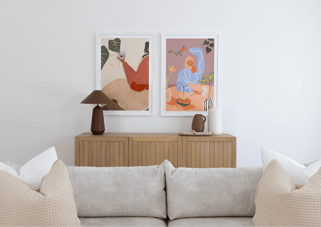
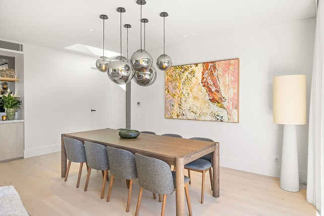
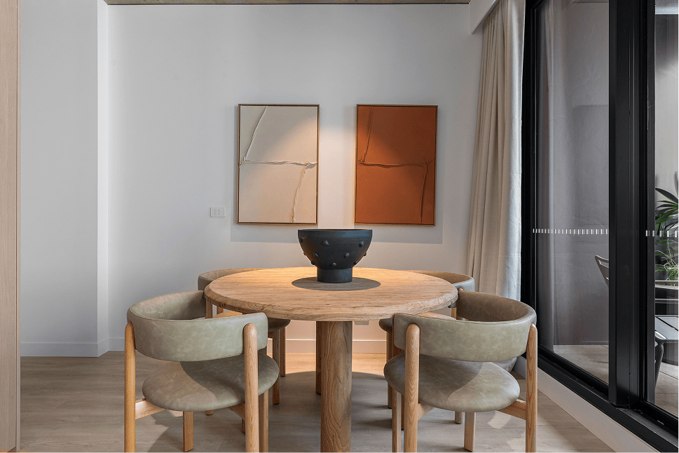
- Bold Artwork: Large, bold pieces of artwork can make a statement. The key is to ensure that the artwork complements the colour scheme of the room. If your walls are neutral, choose pieces that have hints of the same colours, like terracotta or soft greens, to tie the room together.
- Soft Furnishings: Rugs, cushions, and throws are simple ways to introduce small, changing pops of colour. These accents should highlight the room’s overall vibe without overwhelming it.
- Lighting: The right lighting can bring your colour palette to life. Soft, warm lighting will enhance both the bold and neutral elements, ensuring the room feels balanced and inviting.
Interior Design with Art as the Focal Point
When used correctly, art can be the focal point of a room, providing an immediate point of interest. To achieve this, choose a piece that resonates with your personal style, and let it guide the overall design of the room. When you make art the focal point, it’s important that other elements of the room complement the piece rather than compete with it.
For example, if your artwork features vibrant reds or oranges, you can incorporate these colours subtly in the décor through throw pillows, vases, or rugs. This ties the room together, making the art feel like a natural, integral part of the space.
The Impact of Property Styling Colour Palette on Buyer Perception
When styling a property for sale, using the right property styling colour palette can significantly influence a buyer’s mood and perception of the space. Neutral tones create an inviting and versatile foundation, while strategically chosen accent colours – such as deep greens or muted terracottas – can evoke positive emotions and create a sense of harmony.
For example, studies have shown that home staging colours like soft greys and off-whites can make a home feel larger and more open, which is particularly important for potential buyers. These calming tones are easy to imagine in and around, allowing buyers to envision their own personal style in the space.
Balancing bold artwork with neutral interiors doesn’t have to be overwhelming. By considering colour psychology, current seasonal hues like terracotta and deep green, and how these colours affect mood, you can create a harmonious, inviting space.
Whether you’re decorating with statement artwork, learning how to hang art in the living room, or choosing artwork for neutral homes, the key is to allow the art to shine without overpowering the space. Thoughtful integration of artwork into your property styling colour palette can elevate the look of your home, enhancing both its aesthetic appeal and emotional impact.
For more interior styling tips and inspiration, visit our Interior Trends page.
FAQs
What are the best colours for selling a home?
Neutral colours, such as white, grey, and beige, are timeless and appeal to a broad audience. For some added personality, you can introduce accent colours like deep green or terracotta.
How can I use colour in property styling?
Introduce colour through bold artwork or accent pieces while keeping the rest of the room neutral. The key is balance, using bold colours strategically without overwhelming the space.
What are the current interior colour trends in Australia for 2025?
Earthy tones like terracotta and deep green, along with soft pastels and nature-inspired hues, are the top trends in Australian interiors.
How does colour affect a buyer’s mood and perception of a home?
Neutral colours create a calming, spacious feel, while bold artwork or accent colours can highlight features and make a property feel more dynamic and inviting.
Can bold artwork work with neutral interiors?
Yes! Bold artwork can serve as a focal point in neutral rooms, as long as it complements the overall colour palette of the space.