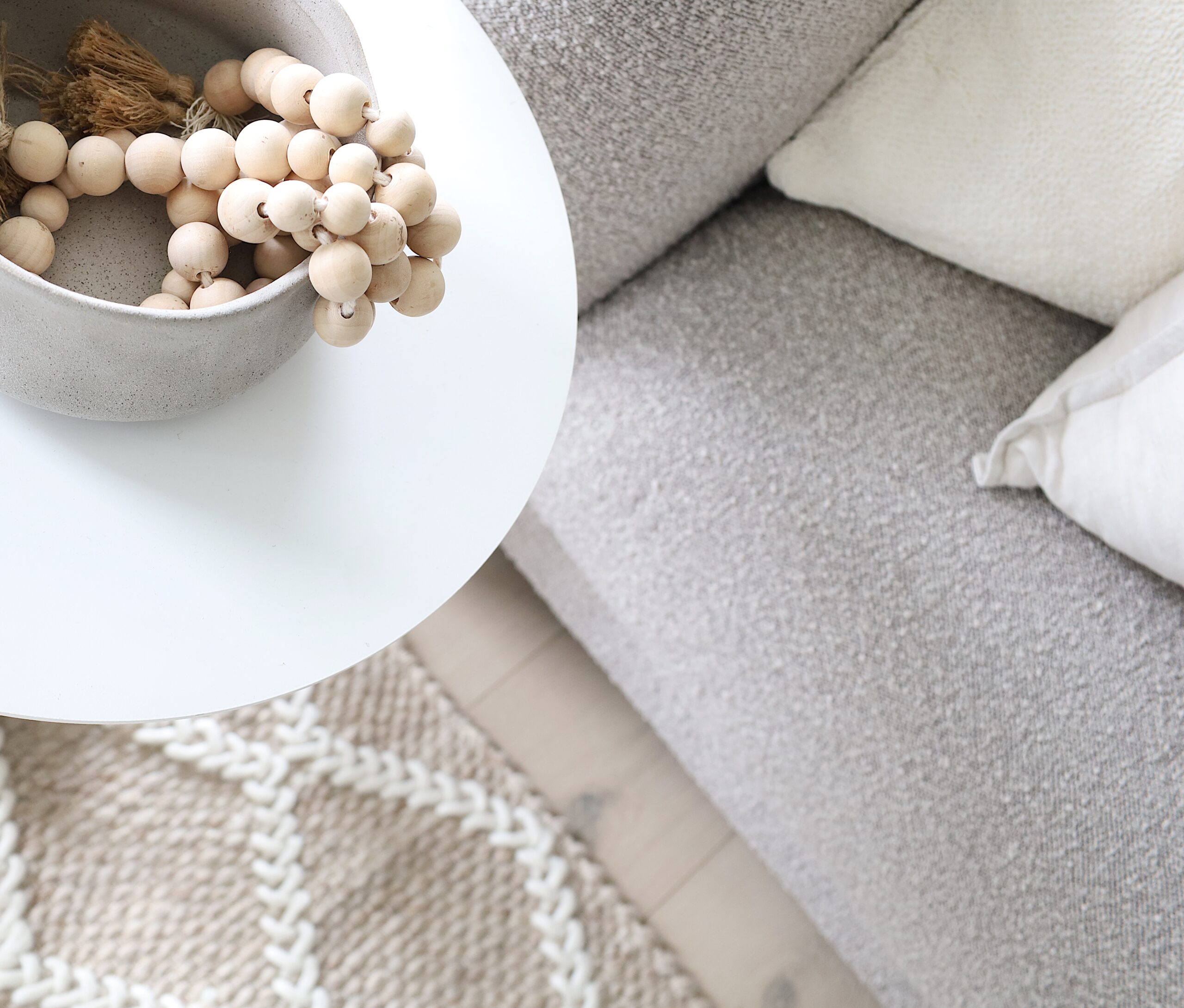
Working with our commercial client, our team landed on delivering a Light Lux colour palette for selling this series of apartments. We focused on creating a bright, airy, and inviting atmosphere that makes the space feel open and welcoming. The colours used in this palette are light and soothing, with a mix of warm and cool tones to create balance and harmony.
Here is a selection of colours that were included in this beautiful palette, and how implementing them into this scheme really brings the brief to life:
Soft white: A soft white colour can help to create a clean and crisp look, while also making the space feel more spacious and open.
Pale grey: A pale grey can add a touch of warmth and sophistication to the space, without overwhelming it with too much colour.
Cream: Cream is a warm and inviting colour that can add a cosy touch to the space, while also keeping it light and airy.
Pale green: A pale green can add a touch of natural freshness to the space, creating a sense of tranquillity and harmony.
While using a Light Lux palette, it was important to keep the overall look soft, subtle, and neutral in order to create a cohesive and inviting space that potential buyers will love.
Share your details with us and we’ll be in touch soon.
